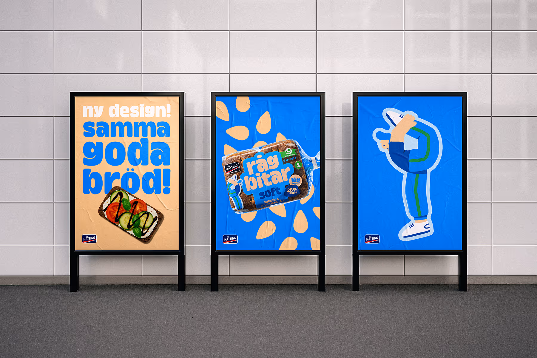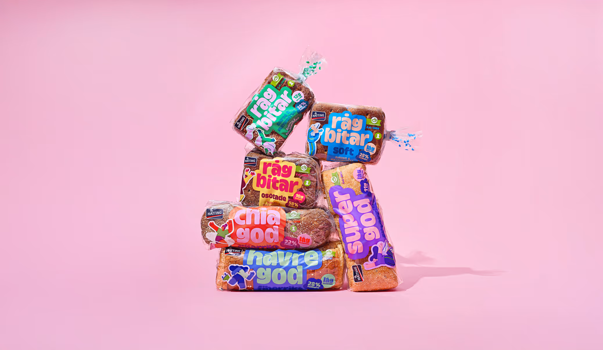
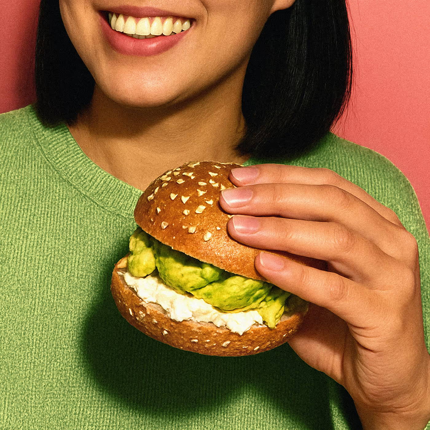
Elevating nutritious bread into everyday sandwich delight
— Hatting is Scandinavian bakery offering a wide range of bread, known for its quality and taste. Identity Works was tasked with revitalizing Hatting's fresh bread line, shifting the focus from nutritional benefits to the enjoyable, energetic experience of consuming Hatting bread.
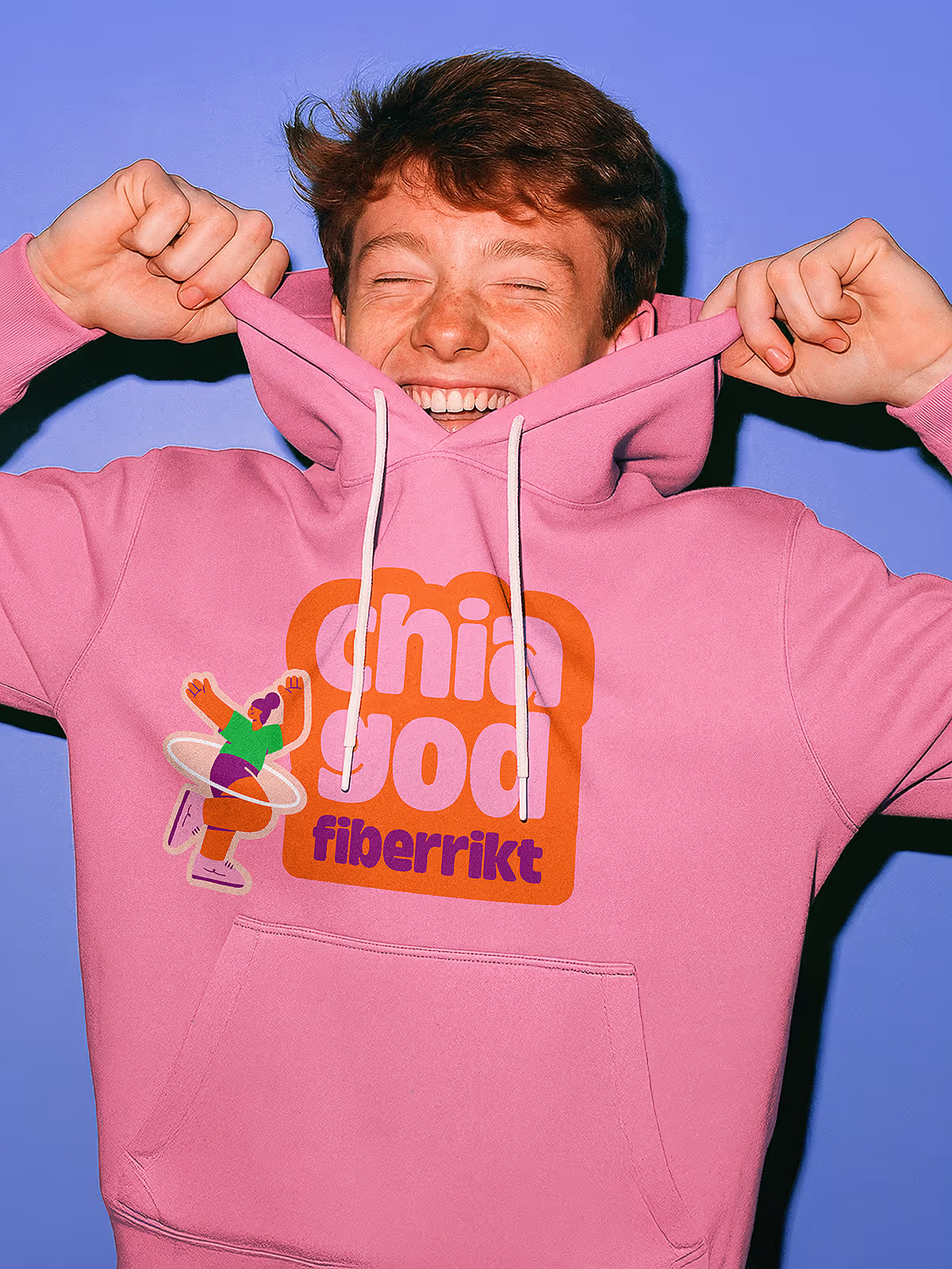
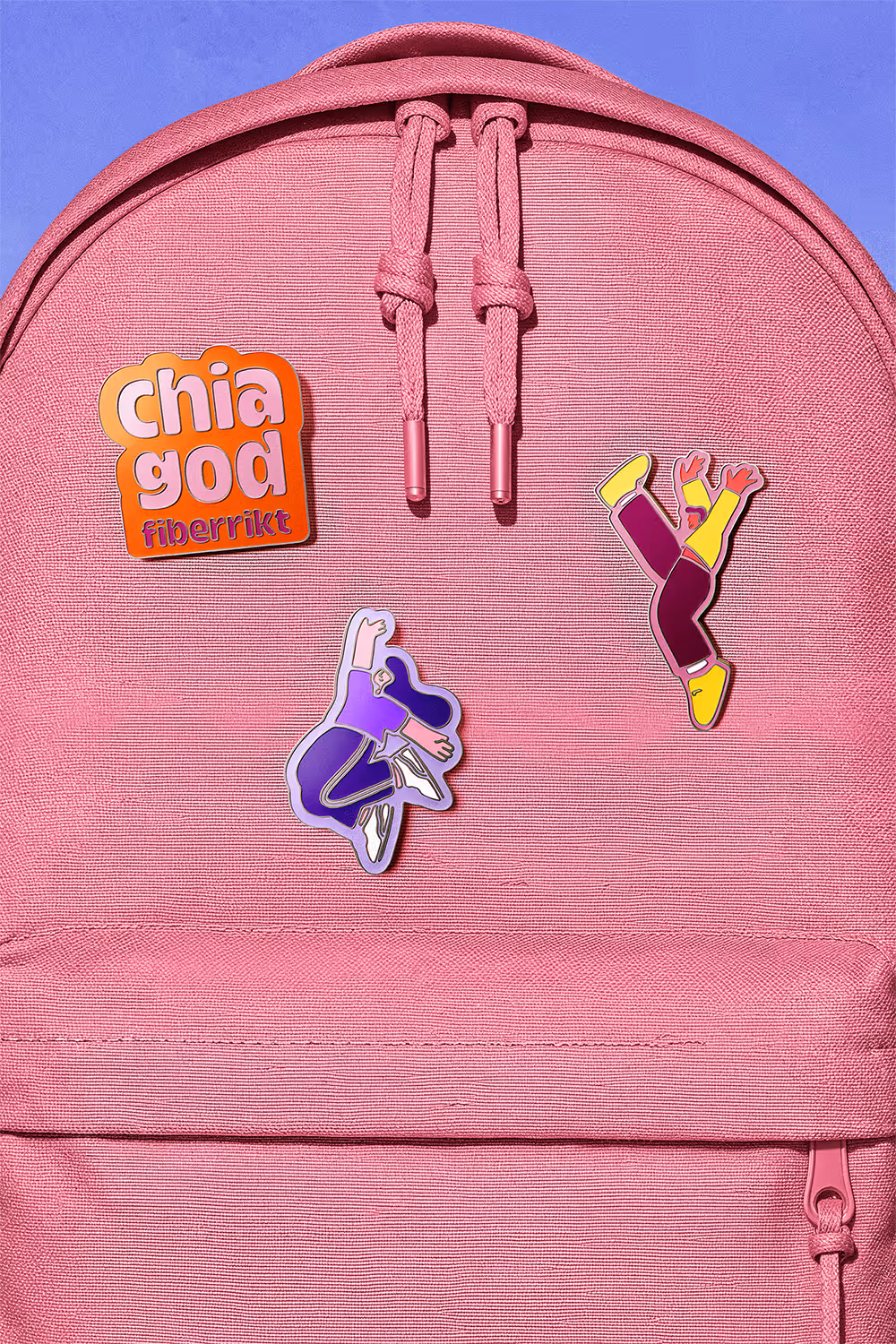
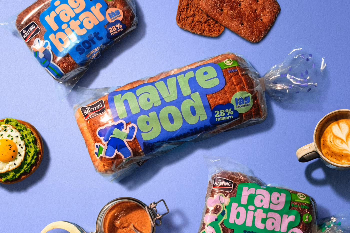
As part of the design duo focusing on shelf impact, we created a bold, playful typeface to reflect the brand’s rich ingredients and used figurative illustrations to convey the nutritious elements in a more emotional way. The vibrant color palette adds a playful, energizing touch, ensuring the products stand out on the shelves.
Read More
Show Less
add_2
Client:
Lantmännen
Employer:
Identity Works
My role:
Designer
Task:
Brand Packaging Design


One year after the packaging redesign was released in markets, Hatting saw an an overall 15% increase in sales.